Dạng bài Mixed Charts là gì? | Cách viết dạng bài Mixed Charts trong IELTS Writing Task 1
Tổng quan về dạng bài Mixed Charts
1. Dạng bài Mixed-Charts là gì?
Multiple Charts/Graph (Mixed Charts) trong IELTS Writing Task 1 là dạng bài gồm có hai bảng biểu biểu thị hai thông tin khác nhau, hai bảng này có thể giống hoặc khác nhau.
=> Để hoàn thành tốt dạng bài Mixed-Charts bạn cần đưa ra những thông tin để so sánh về số liệu, nhận xét chính xác các điểm giống nhau và khác nhau, cuối cùng là kết luận về mối tương quan giữa 2 biểu đồ này.
2. Các dạng bài Mixed Charts phổ biến
Dưới đây là một số dạng bài Mixed Charts IELTS Writing Task 1 phổ biến nhất:
- Table (bảng biểu) với pie chart (biểu đồ tròn)
- Table (bảng biểu) với line chart (biểu đồ đường)
- Table (bảng biểu) với bar chart (biểu đồ cột)
- Pie chart (biểu đồ tròn) với line chart (biểu đồ đường)
- Pie chart (biểu đồ tròn) với bar chart (biểu đồ cột)
- Line chart (biểu đồ đường) với bar chart (biểu đồ cột)
Ví dụ:
Dạng Line chart kết hợp Table:
Dạng Pie chart kết hợp Bar chart:
Dạng Line chart kết hợp Bar chart:
Dàn bài dạng Mixed Charts IELTS WT1
Phần 1: Introduction (Giới thiệu)
Trong phần Introduction, trước tiên bạn cần tóm tắt và paraphrase lại đề bài trong vòng 1-2 câu. Hãy sử dụng vốn từ vựng của mình, tránh việc lặp lại hoặc viết tương tự cả câu từ đề bài. Những thông tin tổng quan cần có:
- Loại biểu đồ: bar chart, line chart, table, pie chart ..
- Khoảng thời gian của hai biểu đồ.
- Nội dung chính của từng biểu đồ.
Ví dụ cho câu Introduction:
The given bar chart illustrates an opinion survey about the factors as to why people choose to go to school, while the pie graph portrays how adults consider the costs of academics should be funded.
Phần 2: Overview (Tổng quan)
Đối với phần Overview của Mixed Chart IELTS Writing Task 1, bạn cần chọn lọc những thông tin/số liệu nổi bật nhất của từng biểu đồ để giới thiệu trong phần này.
Các thông tin quan trọng bạn có thể viết trong phần Overview bao gồm:
- Xu hướng chung của các số liệu qua thời gian (biểu đồ có xu hướng tăng hay giảm? giữ nguyên hay dao động liên tục).
- Số liệu cao/ thấp nhất được cung cấp.
- Sự chênh lệch giữa các số liệu được cung cấp.
Bạn hãy tránh giới thiệu về tất cả số liệu và khía cạnh thông tin của cả hai biểu đồ vì thời gian và quy định số lượng từ có hạn (bạn chỉ được viết khoảng 150 từ trong 20 phút), vì vậy hãy chọn những số liệu nổi bật nhất để giới thiệu và so sánh.
Tùy thuộc vào dạng biểu đồ, bạn có thể tìm sự tương quan giữa chúng bằng cách trả lời những câu hỏi sau:
- Mỗi biểu đồ nêu ra thông tin gì cho người đọc?
- Khoảng thời gian của biểu đồ?
- Đặc điểm nổi bật nhất trong mỗi loại biểu đồ?
- Có điểm nào chung trong hai biểu đồ không?
- Mối quan hệ giữa hai biểu đồ là gì?
Ví dụ cho phần Overview:
Overall, it is apparent in the bar chart that there are seven reasons as to why adults decide to study, and the subject of interest is the most significant one. On the other hand, it can be observed from the pie chart that individual funding for education has had a far higher percentage compared to the other two.
Phần 3: Body (Thân bài)
Đối với phần Body của dạng bài Mixed Charts trong bài thi IELTS Writing, bạn có thể chia làm hai đoạn nhỏ, mỗi đoạn phân tích từng biểu đồ riêng biệt. Bạn có thể áp dụng cấu trúc như sau:
Body 1: Miêu tả chi tiết 2 điểm chính trong biểu đồ 1.
Body 2: Miêu tả chi tiết 2 điểm chính trong biểu đồ 2 + chi tiết một đặc điểm nổi bật nào khác hoặc nêu so sánh.
Một vài điều bạn cần lưu ý khi viết phần Body:
- Vì lượng thông tin cung cấp trong một bài Mixed Charts khá nhiều, bạn không nên miêu tả cả hai biểu đồ trong cùng một đoạn văn vì điều này sẽ dẫn đến việc thiếu logic, thiếu liên kết chặt chẽ giữa các ý, làm người đọc khó hiểu.
- Cần nêu lên được ít nhất một điểm so sánh giữa hai biểu đồ trong bài. Không nêu quan điểm cá nhân của bạn trong bài làm.
Ví dụ:
The bar chart represents seven causes in the survey, with the subject of interest representing the biggest percentage at 40%. Gaining qualifications is the second main reason for earning 38%. Three factors achieved nearly the same share of almost 20% and meeting new people had the lowest percentage at 9%.
The pie chart shows that 40% of the people think that education should be funded individually. However, 35% of the people from the survey assume that it should be paid by the employer while 25% think that it should be funded by the taxpayers, which is the lowest one.
Các bước viết dạng bài Mixed Charts hiệu quả
| Các bước |
Chi tiết |
|
Bước 1: Phân tích câu hỏi
|
Gạch chân hoặc highlight keywords trong đề bài, ví dụ cụ thể dưới đây:
- Tổng quan về biểu đồ: The charts below show the result of a survey of adult education. The first chart shows the reason why adults decide to study. The pie chart shows how people think the costs of adult education should be shared.
- Loại biểu đồ: bar chart, line chart, table, pie chart,…
- Yêu cầu: Summarise the information by selecting and reporting the main features, and make comparisons where relevant.
=> Đừng chọn tất cả các khía cạnh và số liệu trong cả hai biểu đồ vì thời gian và số lượng từ có hạn (hơn 150 từ trong khoảng 20 phút), vì vậy hãy cố gắng gói gọn tính năng chính và so sánh.
|
| Bước 2: Xác định các đặc điểm chính của cả hai biểu đồ |
Tùy thuộc vào loại biểu đồ mà đề bài cho, bạn cần phải tìm ra các đặc điểm này trong từng loại:
-
- Mỗi biểu đồ cho biết thông tin gì?
- Khoảng thời gian là bao nhiêu (nếu có)?
- Đặc điểm nổi bật nhất trong mỗi đồ thị là gì?
- Có bất kỳ điểm tương đồng nào giữa các danh mục trong mỗi biểu đồ không?
- Mối quan hệ giữa hai đồ thị là gì?
Một khi bạn chắc chắn nắm được những chi tiết này từ mỗi biểu đồ, bạn đã sẵn sàng để viết bài thi Mixed Charts IELTS Writing.
|
| Bước 3: Tiến hành viết bài Mixed Charts |
Bây giờ đã đến lúc bắt đầu viết bài IELTS Writing Task 1 Mixed Charts rùi, đảm bảo rằng bạn tuân thủ theo ouline phía trên nhé! |
| Bước 4: Kiểm tra lại một lần nữa |
Đừng để mất điểm vì lỗi chính tả hoặc ngữ pháp sai, vì vậy hãy đảm bảo bạn kiểm tra kỹ bài viết Mixed Charts IELTS Writing Task 1 trước khi tiếp tục với IELTS Writing Task 2. |
Các yếu tố giúp ghi điểm cho dạng bài Mixed Charts
Cấu trúc ngữ pháp
Đối với phần Introduction, bạn có thể dùng cấu trúc:
Tên biểu đồ + illustrates/ gives information in relation to/ provides data about/ compares/ describes + nội dung.
Khi giới thiệu về 2 biểu đồ, có thể sử dụng cấu trúc:
While/ Whereas S + V, S + V.
Ở phần Overview, bạn có thể dùng cấu trúc sau:
It can be seen that/ It is clear that/ Overall,…
Khi bắt đầu phân tích số liệu ở từng biểu đồ trong phần Body, bạn có thể dùng cấu trúc sau:
Regarding/ With regard to/ Concerning/ As can be seen from/ According to + tên biểu đồ.
Từ vựng cho dạng bài Mixed Charts
Trong dạng bài Mixed Charts, tính chất quan trọng của các số liệu luôn nằm ở việc chúng tăng/ giảm/ thay đổi như thế nào trong khoảng thời gian đưa ra trong bài. Tham khảo bảng tổng hợp các động từ, danh từ được áp dụng cho đoạn văn này.
| Xu hướng của số liệu (Trend) |
Động từ/ Danh từ diễn tả |
| Xu hướng tăng |
|
| Xu hướng tăng mạnh |
|
| Xu hướng giảm |
- decrease
- fall/fall down
- go down
- reduce
- decline
|
| Xu hướng giảm mạnh |
|
| Xu hướng tăng giảm bất thường |
|
| Xu hướng ổn định |
- remain/stay stable
- stay unchanged
- stabilize
|
| Đạt mức cao nhất |
- reach a peak
- reach/hit the highest point
|
| Đạt mức thấp nhất |
- reach/hit the lowest point
- fall to a low
- reach a bottom
- falls further to its lowest point of
|
Một số cách diễn đạt trong các bài liên quan đến phần trăm (%):
| Tỉ lệ |
Cách viết |
Tỉ lệ |
Cách viết |
| 5% |
a small fraction |
30% |
nearly a third |
| 10% |
a tenth, one in ten |
33% |
a third, one-third |
| 15% |
less than a fifth |
50% |
a half |
| 20% |
a fifth |
65% |
nearly two-thirds |
| 25% |
a quarter |
75% |
three quarters |
Bài tập mẫu dạng Mixed Charts IELTS Writing Task 1
1. Bài mẫu 1
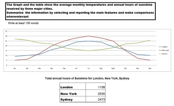
Đề bài: The charts below show how the changes in ownership of electrical appliances and the amount of time spent doing housework in households in one country between 1920 and 2019. Summarise the information by selecting and reporting the main features, and make comparisons where relevant.
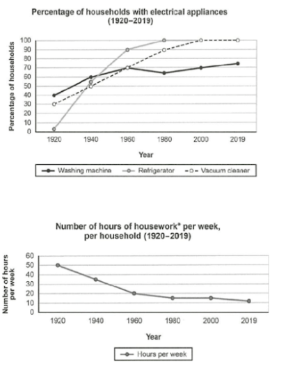
Looking at the first graph, it is clear that the proportion of households possessing these devices increased over time, with every family having both refrigerators and vacuum cleaners by 2019. The most significant change overall was witnessed between 1920 and 1960; whereas the proportion of households with fridges rose markedly from almost none to 90%, those of households with washers and households with vacuums increased more modestly, both reaching 70% in 1960. Afterward, ownership of fridges reached 100% in 1980, and in 2000, ownership of washing machines followed. Ownership of vacuum cleaners slightly dipped to about 65% in 1980 before recovering and reaching its peak of 75% in 2019.
Contrasting the trend of electrical appliance possession, the amount of time that people spent doing housework shrank throughout the period. The first 60 years saw the most notable decline, from 50 hours per week in 1920 to 15 hours in 1980. Then, following another 20-year period of stability, the number of weekly housework hours fell further to its lowest point of about 10 in 2019.
Từ vựng và collocations hay đã dùng:
- Possess (v): sở hữu
- Electrical appliance possession (noun phrase): việc sở hữu các thiết bị điện tử
- Rise markedly: tăng một cách đáng kể
- Modestly (adv): một cách khiêm tốn
- Dip to + data (v): giảm mạnh
- Reaching its peak of + data: đạt đỉnh (số liệu cao nhất)
- Shrink (v): giảm mạnh
- Sth. falls further to its lowest point of + data: giảm sâu tới mức thâm nhất là
Ngữ pháp hay đã dùng:
- Mệnh đề phân từ
- => Looking at the first graph, it is clear that the proportion of households possessing these devices increased over time, with every family having both refrigerators and vacuum cleaners by 2019.
- => Contrasting the trend of electrical appliance possession, the amount of time that people spent doing housework shrank throughout the period.
- => Ownership of vacuum cleaners slightly dipped to about 65% in 1980 before recovering and reaching its peak of 75% in 2019.
- Mệnh đề quan hệ rút gọn => Whereas the proportion of households with fridges rose markedly from almost none to 90%, those of households with washers and households with vacuums increased more modestly, both reaching 70% in 1960.
- Mệnh đề trạng ngữ chỉ sự tương phản => The most significant change overall was witnessed between 1920 and 1960; whereas the proportion of households with fridges rose markedly.
2. Bài mẫu 2
The table and pie chart gives information about the population in Australia according to different nationalities and areas.
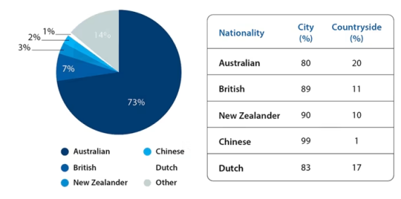
The given pie chart illustrates the percentages of different nationalities that make up the Australian population, while the table gives information about whether they live in urban or rural areas.
In general, it is evident that the vast majority of Australia’s population is of Australian nationality. Furthermore, most people in this country, irrespective of their nationality, opt to live in cities.
The percentage of the Australian population that are of Australian nationality is 73%, whereas the figures for people of British or other nationalities are significantly lower, at 7% and 14% respectively. Meanwhile, 3% of the population come from New Zealand, while 2% are of Chinese nationality. 1% of Australia’s population comes from the Netherlands.
From the table it can be seen that 80% of Australians choose to reside in cities, along with 89% of the British and 90% of the New Zealanders. Similarly, 99% of Chinese live in the city, as do 83% of the Dutch.
(157 words)
3. Bài mẫu
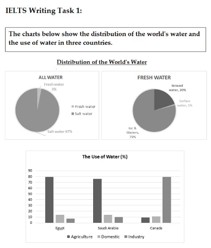
The graph and table below give information about water use worldwide and water consumption in two different countries.
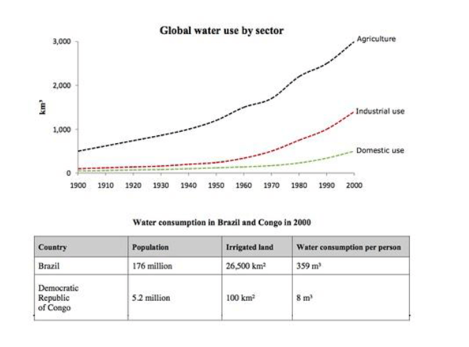
The charts compare the amount of water used for agriculture, industry and homes around the world, and water use in Brazil and the Democratic Republic of Congo.
It is clear that global water needs rose significantly between 1900 and 2000, and that agriculture accounted for the largest proportion of water used. We can also see that water consumption was considerably higher in Brazil than in the Congo.
In 1900, around 500km³ of water was used by the agriculture sector worldwide. The figures for industrial and domestic water consumption stood at around one fifth of that amount. By 2000, global water use for agriculture had increased to around 3000km³, industrial water use had risen to just under half that amount, and domestic consumption had reached approximately 500km³.
In the year 2000, the populations of Brazil and the Congo were 176 million and 5.2 million respectively. Water consumption per person in Brazil, at 359m³, was much higher than that in the Congo, at only 8m³, and this could be explained by the fact that Brazil had 265 times more irrigated land.
(184 words, band 9)
4. Bài mẫu 4
The first chart below gives information about the money spent by British parents on their children’s sports between 2008 and 2014. The second chart shows the number of children who participated in three sports in Britain over the same time period.
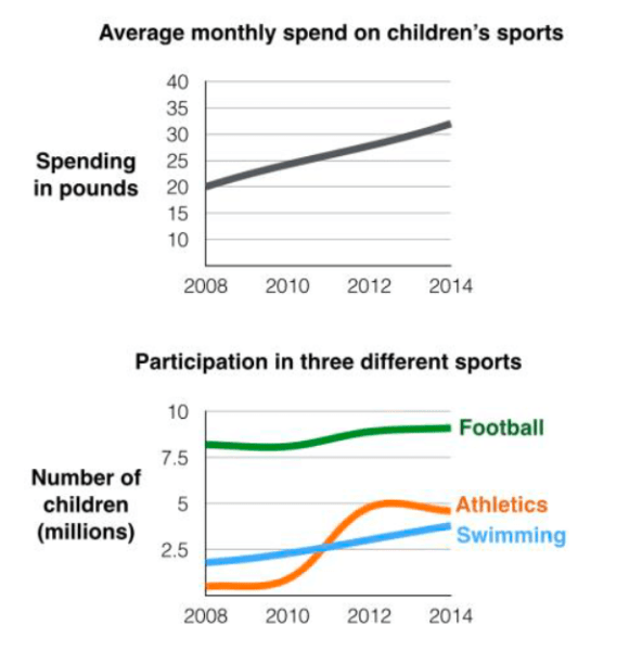
The line graphs show the average monthly amount that parents in Britain spent on their children’s sporting activities and the number of British children who took part in three different sports from 2008 to 2014.
It is clear that parents spent more money each year on their children’s participation in sports over the six-year period. In terms of the number of children taking part, football was significantly more popular than athletics and swimming.
In 2008, British parents spent an average of around £20 per month on their children’s sporting activities. Parents’ spending on children’s sports increased gradually over the following six years, and by 2014 the average monthly amount had risen to just over £30.
Looking at participation numbers, in 2008 approximately 8 million British children played football, while only 2 million children were enrolled in swimming clubs and less than 1 million practised athletics. The figures for football participation remained relatively stable over the following 6 years. By contrast, participation in swimming almost doubled, to nearly 4 million children, and there was a near fivefold increase in the number of children doing athletics.
(185 words, band 9)
5. Bài mẫu 5
The bar chart below shows the proportions of English men and women of different ages who were living alone in 2011. The pie chart compares the numbers of bedrooms in these one-person households.
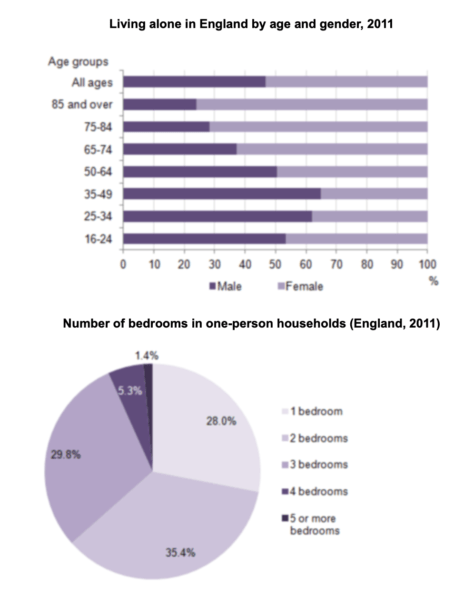
The two charts give information about single-occupant households in England in the year 2011. The bar chart compares figures for occupants’ age and gender, and the pie chart shows data about the number of bedrooms in these homes.
Overall, females made up a higher proportion of people living alone than males, and this difference is particularly noticeable in the older age categories. We can also see that the most common number of bedrooms in a single-occupant home was two.
A significant majority of the people aged 65 or over who were living alone in England in 2011 were female. Women made up around 72% of single occupants aged 75 to 84, and 76% of those aged 85 or over. By contrast, among younger adults the figures for males were higher. For example, in the 35-49 age category, men accounted for nearly 65% of people living alone.
In the same year, 35.4% of one-person households in England had two bedrooms, while one-bedroom and three-bedroom homes accounted for 28% and 29.8% of the total. Under 7% of single-occupant homes had four or more bedrooms.
(189 words, band 9)
6. Bài mẫu 6
The charts below show reasons for travel and the main issues for the travelling public in the US in 2009.
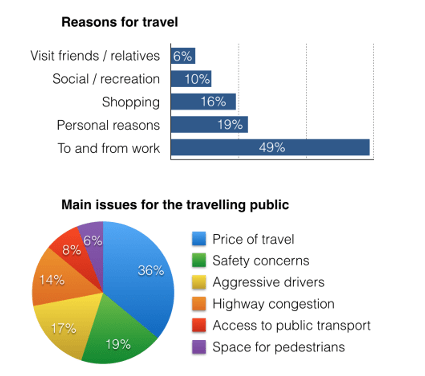
The bar chart and pie chart give information about why US residents travelled and what travel problems they experienced in the year 2009.
It is clear that the principal reason why Americans travelled in 2009 was to commute to and from work. In the same year, the primary concern of Americans, with regard to the trips they made, was the cost of travelling.
Looking more closely at the bar chart, we can see that 49% of the trips made by Americans in 2009 were for the purpose of commuting. By contrast, only 6% of trips were visits to friends or relatives, and one in ten trips were for social or recreation reasons. Shopping was cited as the reason for 16% of all travel, while unspecific ‘personal reasons’ accounted for the remaining 19%.
According to the pie chart, price was the key consideration for 36% of American travellers. Almost one in five people cited safety as their foremost travel concern, while aggressive driving and highway congestion were the main issues for 17% and 14% of the travelling public. Finally, a total of 14% of those surveyed thought that access to public transport or space for pedestrians were the most important travel issues.
7. Bài mẫu 7
Đề bài:
The table provides information about the number of visits to Ashdown Museum in the year prior to and the year following its renovations. The charts displays the results of questionnaires asking visitors to rate their satisfaction with their visit during the same two periods.
Summarise the information by selecting and reporting the key elements, and make comparisons where relevant.

Bài mẫu:
The table illustrates the visitor proportion to Ashdown Museum before and after renovation, while the pie charts show the survey results for visitor satisfaction throughout both periods.
Overall, the results show that following the refurbishment, there was a noticeable rise in the number of visitors and a notable improvement in their satisfaction levels. The percentage of dissatisfied guests decreased significantly after the renovations.
Prior to renovations, the museum only attracted 74,000 visitors. After that, the number of visitors to this museum experienced a significant increase, rising to 92,000 after refurbishment.
Before the restoration, the majority of visitors showed their discontent with the historical site, followed by 30% of them responding that they were satisfied. Additionally, only 15% of visitors expressed excellent satisfaction with the museum. Following the renovation, the percentages of individuals who felt very satisfied or satisfied when visiting increased significantly to 35% and 40% respectively. In contrast, the figures for those who were dissatisfied and very dissatisfied reported a considerable decrease, falling to 15% and 5%, in that order.
8. Bài mẫu 8
Đề bài: The graph and chart below give information on the average daily maximum and minimum temperatures in degrees Celsius (°C) and the average number of days with rainfall each month for two Australian cities.

The graph and charts provided illustrate the comparison of monthly temperatures in Celsius and rainy days between Brisbane and Canberra, Australia.
Despite both cities having similar periodic fluctuations, Brisbane consistently exhibits higher maximum and minimum temperatures than Canberra. Furthermore, the highest number of rainy days in Brisbane occurs in the first half of the year, whereas Canberra experiences the opposite pattern.
Brisbane's maximum and minimum temperatures begin at 28 and 27 degrees Celsius, respectively, and the temperature gap widens from April to July, with a notable difference of 10 degrees. The temperatures then rise in the remaining months and end at just below 30 degrees Celsius. In contrast, Canberra's temperatures maintain a gap of 8-10 degrees Celsius throughout the period. The maximum and minimum temperatures in this city start at 22 and 13 degrees Celsius in January, respectively, before experiencing a significant drop, reaching troughs of 10 and 1 degree Celsius in July before rising again later in the year.
Regarding the number of rainy days, Brisbane experiences 10-14 rainy days in the first five months, with the highest number of rainy days recorded in February and March. After remaining constant at 10 days from June to August, this figure decreases by three days in December. On the other hand, Canberra experiences seven rainy days from January to September, with eight days in March. There is a 50% increase in the number of rainy days in the last quarter of the year, with the figure ending at 12 days.
9. Bài mẫu 9
Đề bài: The chart and table below give information about what nursing graduates did after finishing their course in the UK in 2009.

Bài viết tham khảo:
The pie chart details the destination of nursing graduates whilst the table gives a closer look at the statistics regarding workers in health sector in the UK in 2009.
As can be seen from the graph, a vast majority of nursing graduates decided to join health workforce, whereas very few preferred to pursue tertiary education or switch to other jobs. Meanwhile, the table reveals that working as a hospital nurse was the destination of many graduates.
Regarding the pie chart, participating in health sector was the most popular choice among nursing graduates, accounting for 84% of total people in the report. Working and study made up much smaller shares with 8%, whilst 4% of graduates were reported to be unemployed. At the same time, a negligible 2% pursued further study, and another 2% worked in other fields after graduation.
The table shows that most graduates who chose to work in health sector favoured nurse positions in hospitals, representing nearly three-fourths of the total surveyed people. In second place was midwifery jobs with 12.4%, which was followed by community nurse positions with 10.3% of total participants. Last came graduates employed in other, paramedic and mental nurse roles, accounting for a negligible 2.7%, 1.3% and 0.4% respectively.
10. Bài mẫu 10
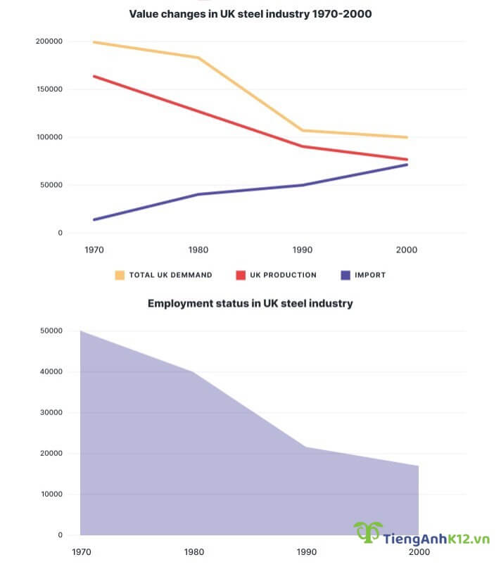
Đề bài: The graphs show the changes in the UK industry steel between 1970 and 2000. (đơn vị milliontonnes vs thousand)
Bài viết tham khảo:
The charts detail value changes in the steel industry and the number of workers employed in the UK between 1970 and 2000.
A glance at two graphs shows that with the exception of steel import total demand for production and demand for employment all underwent a drastic downturn. Another interesting highlight is that the UK only started to import steel after 1970.
At the beginning of the period, the production of steel in the UK was the highest at around 165,000 tonnes; however, this number was nowhere to meet the total demand for this product at 200,000 tonnes. Steel import, at this time, was nearly zero. Over a 30-year period, both total steel demand and production halved year-on-year, finishing at 100,000 tonnes for the former and approximately 80,000 tonnes for the latter. Meanwhile, the year of 2000 recorded a steady rise of 75,000 tonnes in the import values, slightly lower than the production of steel.
With respect to the workforce, there were 50,000 employees in this industry in 1970, and there seemed to be a corresponding decline in this figure as the total demand dropped over the years. With a steep dip from 40,000 to just above 20,000 between 1980 and 1990, the number of the labour force hit its trough of roughly 170,000 in 2000.
10. Bài mẫu 11
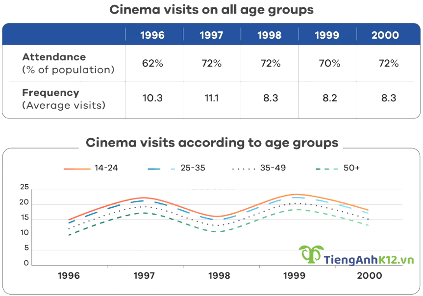
Đề bài: The graphs below show the cinema attendance in Australia and the average cinema visits by different age groups from 1996 to 2000.
Bài viết tham khảo:
The table shows statistics on cinemagoers regardless of age between 1996 and 2000, whereas the line graph depicts how often Australian people of different ages went to the cinema during the same period.
Overall, it is clear that despite a gradual dip in frequency, there was a sharp rise in cinema attendance over the years. On the whole, the younger the attendants were, the more likely they were to enjoy visiting the cinema.
In 1996, cinema attendance accounted for 62% of the total Australian population. This figure then went up quickly to 72% a year later before fluctuating around 71% until 2000. The number of average visits, on the other hand, recorded a negligible increase from 10.3 in 1996 to 11.1 in 1997, followed by a drop to 8.3 in 2000.
With regard to the number of cinema visits, these figures reflected similar fluctuating trends throughout the years with two peaks in 1997 and 1999. Going to the cinema appeared to be a popular activity among younger demographics as people from 14 to 24 paid 15 visits on average in 1996, followed by people aged 25-35 (14 visits), 35-49 (12.5 visits) and over 50 with only 10 visits. Aside from peaks reached in 1997 and 1999, the figures for 4 age brackets also experienced a dip in 1998 before finishing at the same ranks at around 18 visits for 14-24 age group, 17 visits for 25-35 group, 15 for 35-49 group and just below 14 for over 50 group.
Xem thêm các tài liệu Tiếng Anh hay, chi tiết khác:
TOP việc làm "HOT" dành cho sinh viên


Bình luận (0)
Đăng nhập để có thể bình luận
Chưa có bình luận nào. Bạn hãy là người đầu tiên cho tôi biết ý kiến!