IELTS Writing Task 1 có bao nhiêu dạng & Tổng hợp bài mẫu IELTS Writing Task 1 siêu hay (2025)
1900.com.vn tổng hợp và giới thiệu bài viết IELTS Writing Task 1 có bao nhiêu dạng & Tổng hợp bài mẫu IELTS Writing Task 1 siêu hay giúp bạn nắm vững cách làm bài, nâng cao vốn từ vựng và đạt kết quả cao trong bài thi Tiếng Anh.
IELTS Writing Task 1 có bao nhiêu dạng & Tổng hợp bài mẫu IELTS Writing Task 1 siêu hay
IELTS Writing Task 1 có bao nhiêu dạng?
Trong bài viết IELTS Writing task 1, các dạng bài thường gặp bao gồm:
Bảng số liệu (Table)
Biểu đồ cột (Bar chart)
Biểu đồ đường (Line graph)
Biểu đồ tròn (Pie chart)
Biểu đồ kết hợp (Multiple charts / Mixed charts)
Map (Bản đồ)
Quy trình (Process)
Mặc dù có nhiều dạng bài nhưng bố cục chung của một bài IELTS Writing Task 1 thường sẽ như sau:
Introduction: Mở bài bằng cách diễn đạt lại (paraphrase) đề bài
Overview: Khái quát lại 1, 2 điểm nổi bật của biểu đồ/bản đồ
Detail 1: Viết chi tiết nhóm thông tin 1
Detail 2: Viết chi tiết nhóm thông tin 2
Tổng hợp các mẫu IELTS Writing Task 1
Lưu ý chung: Bạn hãy dùng thì quá khứ đơn để mô tả số liệu các năm trước (thường là so với hiện tại) và thì tương lai đơn để dự đoán số liệu các năm sau. Nếu không có thời gian cụ thể, hãy dùng thì hiện tại đơn.
Bạn cần viết trong khoảng 150 từ, đừng viết nhiều quá và cũng đừng viết ngắn quá.
Khi viết Overview về biểu đồ hoặc bản đồ, bạn chú ý chỉ mô tả những thay đổi rõ rệt nhất và mô tả chúng trong 1, 2 câu. Còn với dạng quy trình, hãy mô tả các bước thực hiện, cùng với bước đầu và bước cuối của quy trình.
Khi triển khai nội dung chính, bạn không cần phải sử dụng tất cả những số liệu trong biểu đồ nhưng cũng đừng bỏ qua quá nhiều. Đối với số liệu, hãy đánh dấu những con số quan trọng (lớn nhất, bé nhất), nếu bảng có mô tả thời gian (theo năm, tháng,…), bạn hãy đánh dấu những khoảng thời gian có số liệu thay đổi rõ rệt nhất. Còn đối với bản đồ hay quy trình, việc đánh dấu những thay đổi chính cũng rất quan trọng.
Cuối cùng, bởi vì đề bài chỉ yêu cầu bạn “summarize the information” – tóm lược thông tin, nên đừng cho ý kiến cá nhân vào bài viết nhé.
Bảng số liệu (Table)
The table below gives information about the values (NZ$) of exports of kiwi fruit from New Zealand to five countries between 2010 and 2012. Summarize the information by selecting and reporting the main features, and make comparisons where relevant.
Country
2010
2011
2012
Japan
$ 271,000,000
$ 287,000,000
$ 325,300,000
China
$ 74,900,000
$ 84,800,000
$ 94,000,000
Mexico
$ 1,200,000
$ 2,400,000
$ 3,000,000
Russia
$ 968,000
$ 1,585,000
$ 2,404,000
Saudi Arabia
$ 29,000,000
$ 106,000
$ 82,000
Bài mẫu
The values of kiwi fruit from New Zealand exports to five nations between 2010 and 2012 are shown in the table.
Overall, it is evident that Japan was New Zealand’s largest export market. In addition, over the course of three years, the value of kiwi exports to Saudi Arabia fell significantly, while the reverse was recorded in the remaining countries.
In 2010, exports of kiwi fruit to Japan were more than 270 million dollars, nearly three times that of China and ten times that of Saudi Arabia. This year, exports to Mexico and Russia brought in lesser money, with 1.2 million for Mexico and 968,000 dollars for Russia.
By 2012, exports to Japan increased significantly and totalled more than 325 million dollars. A rise in the figures for China, Mexico, and Russia was also witnessed at 94million,3.3 million, and 2.4million,respectively.However,in2011,thevalueofkiwiexportstoSaudiArabiahadonlydecreasedto106,000, and by 2012, it had reached $82,000.
Biểu đồ cột (Bar chart)
The chart below shows the total number of minutes (in billions) of telephone calls in the UK, divided into three categories, from 1995-2002. Summarize the information by selecting and reporting the main features, and make comparisons where relevant.
Bài mẫu
The bar graph illustrates the amount of time people in the United Kingdom spent on three different types of phone calls between 1995 and 2002.
In terms of overall usage, it is clear that calls made via local – fixed lines were the most popular type throughout the shown time period. Despite having the lowest figures on the chart, mobile calls also hold the most dramatic increase in user minutes.
In 1995, people in the United Kingdom used fixed lines for just over 70 billion minutes for local calls, and roughly half of that time for national or international calls. Mobile phones, on the other hand, were only used for about 4 billion minutes. Over the next four years, the numbers for all three types of phone calls grew steadily.
By 1999, the duration of time spent on local calls over landlines had reached an all-time high of 90 billion minutes. Following that, the figure for this category decreased, but the other two types of phone calls continued to rise. In 2002, the number of minutes spent on national and international landline calls surpassed 60 billion, while mobile phone calls reached around 45 billion minutes.
Biểu đồ tròn (Pie chart)
The pie charts below show information about where coffee is produced, consumed and where its profit goes. Summarise the information by selecting and reporting the main features, and make comparisons where relevant.
Bài mẫu
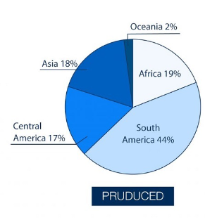
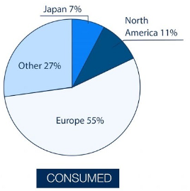
The three pie charts provided information about the production and consumption of coffee, along with the distribution of the profit.
Overall, it is notable that South America is the most productive region, Europe is the largest consumer, and shippers benefit the most financially.
Looking at the coffee production graph, South America has the highest figures (44%), followed by Africa, Asia, and Central America (19%, 18%, and 17%, respectively), with Oceania trailing far behind at 2%. In terms of consumption, Europe (55%) and other regions (27%) have the highest proportions, while North America (11%) and Japan (7%) have much lower proportions.
Interestingly, while Europe and North America do not produce coffee, they consume a significant amount of it.
Regarding profit earners, shippers and sellers are the biggest winners (55% and 25%, respectively), while explorers and producers only make 10% each. Once more, those who sell and deliver coffee goods are not involved in the production process, but collectively earn 80% of the total revenue.
Biểu đồ kết hợp (Multiple charts / Mixed charts)
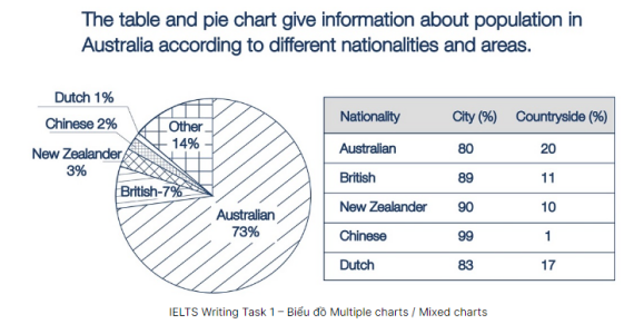
The 2 charts below give information about the population in Australia according to different nationalities and areas. Summarise the information by selecting and reporting the main features, and make comparisons where relevant.
Bài mẫu
The pie chart depicts the percentage of people of various nationalities living in Australia, whereas the table displays demographic data divided into urban and rural areas.
Overall, the pie chart gives the impression that the vast majority of Australians claim to have ancestors of Australian origin. It is also notable from the table that most Australians, regardless of ethnicity, are urban dwellers.
According to the pie chart, ethnicity accounts for nearly three-quarters of the total population in Australia. This is followed by figures for people from the United Kingdom (7%), and New Zealand (3%). People of Chinese and Dutch origin, on the other hand, made up a negligible 1-2% of the population.
Looking at the table, roughly 80% of Australians and New Zealanders live in cities, with only about 20% living in the countryside. A similar picture can be seen in the figures for people from China and New Zealand, where the urban population is 90-99%.
Map (Bản đồ)
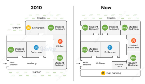
The diagrams give information about changes in a student accommodation. Summarise the information by selecting and reporting the main features, and make comparisons where relevant.
Bài mẫu
The maps depict changes to a student housing building from 2010 to the present.
Overall, the building has been extensively renovated, with significant changes to the student bedrooms and gardens. Furthermore, as a result of the remodelling, more entrances are added.
In 2010, the building was surrounded by three gardens to the northwest, north, and south of the map. However, only the northern one remains today since the other two have been replaced by a new student bedroom and a parking lot. The number of student bedrooms also increased from three to five, replacing the former living room.
The current structure is also more accessible, with more doors connecting the rooms to one another and to the outside. Other significant changes include the addition of an en-suite room and a new social area in the kitchen. The large bathroom in the centre of the map, on the other hand, remained unchanged over the period.
Quy trình (Process)
Bài mẫu
The diagram depicts the various stages of development of a frog throughout its life cycle.
Looking at the process, a frog devels through six distinct stages, starting with the mating of male and female frogs and ending with the appearance of the fully grown adult frog.
In the beginning, the female frog initially lays a lot of eggs in the water, which is visible as a frogspawn. The frog develops from its eggs into an embryo, and then each frogspawn hatches, releasing the immature tadpole. Tadpoles that attach to water plants grow longer and develop external gills for breathing.
The tiny tadpole develops remarkably, developing hindlegs, and now it survives on food stored in its tail. At the next stage, the tadpole continues to grow into a young frog, which has two extra legs but a shorter tail. It grows in size, loses its tail, matures into an adult frog with the ability to reproduce, and the cycle repeats.
Xem thêm các tài liệu Tiếng Anh hay, chi tiết khác:
1900.com.vn tổng hợp bài viết về Câu điều kiện loại 1 (First Conditional) đầy đủ các kiến thức bao gồm: Định nghĩa, cấu trúc ngữ pháp, cách dùng, các ví dụ minh họa và bài tập vận dụng. Từ đó giúp bạn nắm vững kiến thức và học tốt Tiếng Anh hơn.
1900.com.vn tổng hợp bài viết về Speaking Forecast 2023 | Bộ đề dự đoán chi tiết mới nhất cung cấp cho người học một loạt các chủ đề, câu hỏi và phương pháp luyện tập để giúp họ nâng cao khả năng giao tiếp tiếng Anh của mình. Từ đó giúp bạn nắm vững kiến thức và học tốt Tiếng Anh hơn.
1900.com.vn tổng hợp bài viết về Talk about festival in Vietnam - một trong những chủ đề vô cùng thông dụng, thường xuyên xuất hiện trong đề thi thực chiến. Từ đó giúp bạn nắm vững kiến thức và học tốt Tiếng Anh hơn.